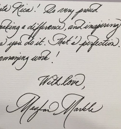
I must admit my first reaction to Meghan Markle's handwriting was not positive. I didn't like the showiness of it. But first impressions can be deceiving, so I was determined to do a proper handwriting analysis, untainted by reading any of the copious numbers of press articles on her or indeed, any other graphology analyses of her writing. Was my first impression wrong?
Firstly, calligraphic handwriting is notoriously difficult to analyse. This is because Calligraphy is a purposefully aesthetic and consciously artificial art form. If other handwriting samples by the same writer also follow this style, the graphologist must assume that this is the writer’s day-to-day handwriting. The stylistic flourishes that abound are mere show, much like garnish on a restaurant dinner plate. Putting that to one side, what does this handwriting reveal?
This is a strong, determined handwriting that wants to impress. There is an emphasis on presentation (illustrated by the carefully constructed letter forms), rather than natural self-expression (how the writing moves across the page).
In other words, the writer needs an audience. This makes her ideal for life in the public eye. She is a natural performer, skilled at presenting the ideal image demanded by her role.
Her self-control and tenacity are formidable. She is an independent woman who has strong convictions and a need to rise up in the world.
Her image-consciousness is all part of an identity unconsciously constructed, that helps her cope in a complex environment, and protects her inner self from the slings and arrows of an unforgiving world. After all, we all use defence mechanisms to protect ourselves when we unconsciously feel that somehow we just ‘aren’t good enough.’ Her past has taught her to distrust the outside world and to rein in her emotions.
The writer has a desire for control and a need to play an important and prestigious role, as a way of proving her worth. A proud, ambitious lady, she has the strength to overcome obstacles in her path and strive to reach her goals. She is demanding of herself and others, and sets high standards that require effort and dedication to maintain.
She sees the world in simple terms and is not one for delicate nuances or ‘grey areas’. However, she is patient, meticulous and has strongly-held beliefs, especially concerning what is ‘right’ and ‘wrong.’
Regarding her future, I have some questions that will only be answered in the fullness of time: Will she have the flexibility to listen to others and adapt to changing circumstances? Will she be able to take a back seat and fall in line according to the needs of ‘the organisation’? How will she cope when she has to step out of the limelight?
Only time will tell. One thing is certain – this is a strong and principled lady.
FOR GRAPHOLOGY NERDS
Below are excerpts of my graphological process (i.e. how I worked out the above portrait). It is based on a procedure used by the British Academy of Graphology, and outlined in the 'International Manual of Graphology' (Keefe, Herbert, Stirling, Riley, 2013). This will be of interest to graphologists, rather than the general public.
General Impression
An affected, calligraphic writing that appears to be trying to put on a stylish front. It's forms and spacing are aesthetically pleasing but not altogether natural. The large, curved regressive gestures that punctuate the writing have an artificial appearance.
Form takes centre-stage, in a writing where presentation is everything. Movement is highly controlled, therefore there is little spontaneity. The use of space is pleasing and the layout in orderly. The stroke seems warm but taut. Her signature is larger than the text but similar in style. It is placed near the bottom right hand of the page.
Global Pointers
Tension: T5 (Rigid)
Structure: Overstructured
Open/Closed: Closed
Axes: Vertical
Movement type: Obstructed, some Static/Controlled
Signs
Stylised, Narrow, Artificial, Right Slant, Orderly
Tall, Large, Arcades, Clear, Lean, Ovoid 'o's, Bow Ties
 RSS Feed